↩ Back to the list of all bugs
Reported bug #4224961 at Saturday August 20 2005, 2AM GMT.
Current state: Open (as of 2006-07-24)
Radar link for Apple Developers
- Product/Component:
- Developer Tools
- Severity/Classification:
- Other Bug/Has Workaround
- Is It Reproducible?:
- Always
- Version/Build Number:
- Interface Builder 2.5.1 (439)
- Problem Report Title:
- Interface Builder Classes tab outdated, doesn't use suitable interface elements
Problem Details:
Summary:
The Classes tab in Interface Builder's Cocoa document window looks like it hasn't been changed in years (which it probably hasn't, and which wouldn't be so bad if it wasn't a usability train wreck), doesn't use suitable interface elements as required by the Human Interface Guidelines, and has a control that looks like it should do one thing but does another thing.
Steps to Reproduce:
Open (or create) a Cocoa NIB in Interface Builder. In the document window, switch to the Classes tab.
Expected Results:
A Classes tab that would conform to the Apple HIG and be usable.
Actual Results:
A Classes tab that contains controls with dubious usability semantics, controls that would be better off as other controls, and generally does not conform to the Apple HIG. A full discussion is provided under "Notes", later on in this report.
Regression:
N/A.
Notes:
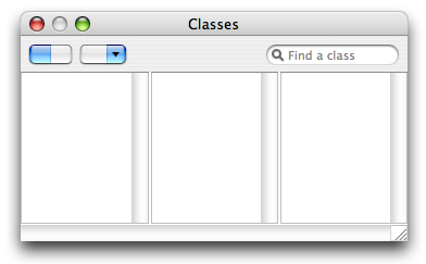
The "segmented control" to the left to toggle between list view and column view is just a button with an image, as opposed to an honest-to-goodness NSSegmentedControl. If you are in list view mode and click the list view mode half of the "segmented control", you change to column view mode, because the thing is just a button with an image. The "segmented control" also shadows on click, because it is just a button with an image. The "segmented control" is also blurry. Switching to a real NSSegmentedControl would fix the unexpected behavior (click on active mode to switch to another mode) and fix the faulty appearence.
The drop down button with a magnifying glass (there's no tooltip/help tag for it that details its real name) has a magnifying glass on it, when the Mac OS X Heart favorites icon would be much better in terms of describing its function - giving access to common classes, both Cocoa-default and one's own subclasses.
The search field, while functioning the way you could expect an NSSearchField to work while still keeping class hierarchy intact, looks like a vanilla NSTextField. The search field would be much better off being an NSSearchField and losing the "Search:" label - the search field control is recognizable by form, and the magnifying glass belongs to the search field control more than to the "favorite" drop down button with a magnifying glass.
Perhaps the drop down button with a magnifying glass could be implemented as part of the NSSearchField's menu, should the search field become an NSSearchField?
Finally, most controls mentioned above ("segmented control", drop down button with a magnifying glass, arguably the search field) are too close to the column/list view. It is my opinion that these controls would look better if more centered vertically between the tab bar and the column/list view. This would also increase the space between the controls and the column/list view, making it harder to lose a selection by moving the mouse a few pixels lower than intended and clicking in the column/list view instead - a usability gain.
Attached is a proposal of how the redesigned Classes tab might look - sans icons, sadly.